
data visualization
The Art of Storythinking: Compelling Storytelling + Critical Thinking
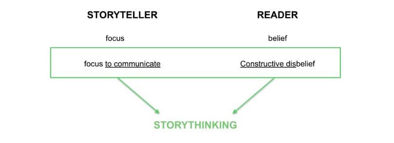
In essence, storythinking is about understanding two characters - the storyteller and the reader - and how they play a role in the creation and interpretation of a presented piece of information.
When I was in elementary school, every year we had standardized testing. One of my favorite parts (not sure if it’s still a part of the testing) was the picture prompt. They gave us a weird picture like the one you see below (https://images.app.goo.gl/Sfj1tahDJNy7PKu67) and our job was to write a story about it. We could tell any story we wanted based on this picture. The sky was the limit. But there was one requirement - it needed to make sense. It had to create some sort of logical reality - even if that reality did not match our own.

“A picture is worth a thousand words”
Whether for better or for worse, data, or any visual representation of data is the same. It has been represented in a visual manner not as a translation (not a 1:1 relationship with the truth) but as a representation in order to communicate some sort of idea in a simpler manner, in order to make the data or what it is trying to communicate more palatable.
But data visualization is in a sense also like trying to describe a mountain range with a map…
Let’s take this map (https://images.app.goo.gl/Nj6LZ8g6ZuT7DBwY8) of the Polish Tatra Mountains for example.
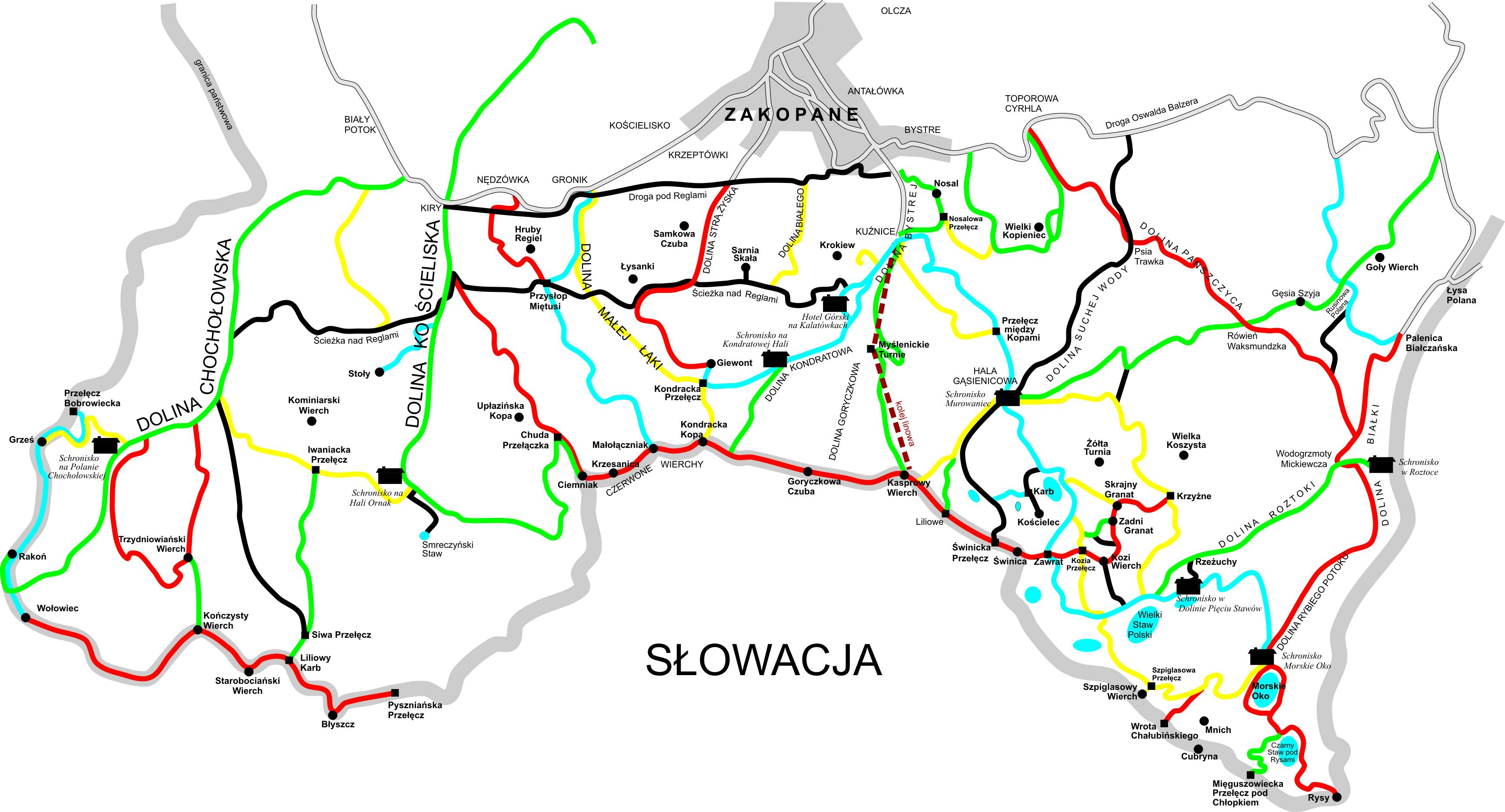
Here you are missing its fullness. It’s shape, it’s smell, it’s intricacies. I can tell you from personal experience that a visual representation of the trails will never come close to the reality that you experience while you are on them. There’s no level of detail that can capture each path condition.

So we know from the beginning that a representation of reality is imperfect. But why, then are stories/graphics so popular? They can’t be perfect, but they can be compelling. They are compelling not because they describe reality in its fullness, but because they focus in on a single thread of reality so tightly that our minds can blur the background. We can grow to believe that what it is showing - that small sliver - is in fact the entire picture.
The Storyteller and the Reader
A compelling story is most commonly: short and tight. It is specific and absorbing. A compelling visualization, in a similar manner, makes every element count.
This notion gives us a definition of the storyteller: the producer of a story that creates a sliver of reality by focusing on particular elements. We are capable of directing a user’s focus to particular elements so that they blur the background.
Compelling stories aren’t just tight though - they generally make sense. In a compelling story, the reader can submerge into the reality presented by the story; even if it does not necessarily match their true reality. Think Harry Potter - in our reality, things like Harry’s invisibility cloak or the magic Marauder’s Map, wouldn’t fit, but in Hogwarts, we don’t question their validity at all. For the interpreter, context is key to operating within this realm of belief.
So if we have the storyteller and we have the interpreter of that story, where does the storythinker come into play?
Storythinking is really about understanding these two characters, and how they play a role in the interpretation of a presented piece of information. It’s about thinking critically about what has been presented. As the creator of a visualization, storythinking is about focusing in a manner to communicate, not to convince. As the consumer, it’s not about blind belief, but about constructively disbelieving, so that we can engage deeper in uncovering the hidden truth.
- Storythinking - n - understanding that a story is a sliver of reality, not the whole; using that knowledge as the creator to empower the reader to uncover truth alongside you, not from you; using that knowledge as the reader to think critically about what has and what has not been presented
So, if we understand: how to apply focus (PART I) AND how to question whether that focus is justified or not (PART II), then we have the knowledge we need to produce valid representations of information.
PART I: Materials and Modifications
Materials are the building blocks of visualizations. This is what we have to work with and includes:
- Shapes (circles, squares, lines)
- Space (separation between elements, our graph paper)
- Size (of points, of labels, etc.)
- Text labels
- Data
Modifications are the adjustments we apply to those aforementioned materials to direct the audience’s eye. These are the levers we can pull to make the graphic more interesting and captivating to the end user:
- Colors
- Animation
- Data transformation (log vs. linear)
- Scales (y-axis, x-axis, size of points)
- Domain (what extent of data to include)
- Range (what space to map the data to on the page)
- Type of chart used (continuous or discrete, line chart or scatter plot)
PART II: Meaning and Mapping
This is where the critical interpretation of a visualization comes in. The first question we ask ourselves at this stage is: “does each modification of materials provide new information or is it replicative of that information presented by another modification?” With this in mind, the storythinker asks, “why this?” to each component of the chart:
- Does each piece of the chart exist for a reason - colors, scales, shapes, labels?
- Is there enough context provided for the audience to know what this means?
- Are we adding color just to add color, or does it have unique meaning?
Mapping, then, is the reflection upon whether the meaning of each element is consistent with the reality it is trying to represent:
- Would two separate consumers come to the same understanding of the meaning of our modifications?
- Does it follow our natural heuristics or go against them? (For example, if we are showing data of temperatures, are warmer temperatures represented as red and colder as blue, as our heuristics would suggest they should be?)
- Is our data accurate, have we shown enough data points for logical conclusions to be drawn?
Sharing the Truth
If, as developers and consumers of information, we engage deeper on the selection of our Materials, Modifications, and the Meaning and Mapping that those provide, we are properly posed to engage and inform. When it comes to data visualization, it isn’t necessarily about sharing the truth (that we think we possess);it’s about empowering an audience to uncover the truth themselves. It’s about truthfully sharing. An honest and engaging visualization will not seek to share it’s version of the truth, it will empower Truth to share itself.
Storythinking is about understanding two characters: the storyteller and the reader, and how they play a role in the creation and interpretation of a presented piece of information.